How to - EDA
Steps I follow to do EDA on any new dataset.
How to : EDA
The content of this blog was originally written as personal notes that I created after reading “Think Stats 2e”. Since then, I follow it every time I start working with a new dataset. Finally, I decided to turn this into a blog post for two reasons:
- So, others can also benefit from it.
- I can access it from anywhere.
Without ado, lets dive right in . . .
Steps
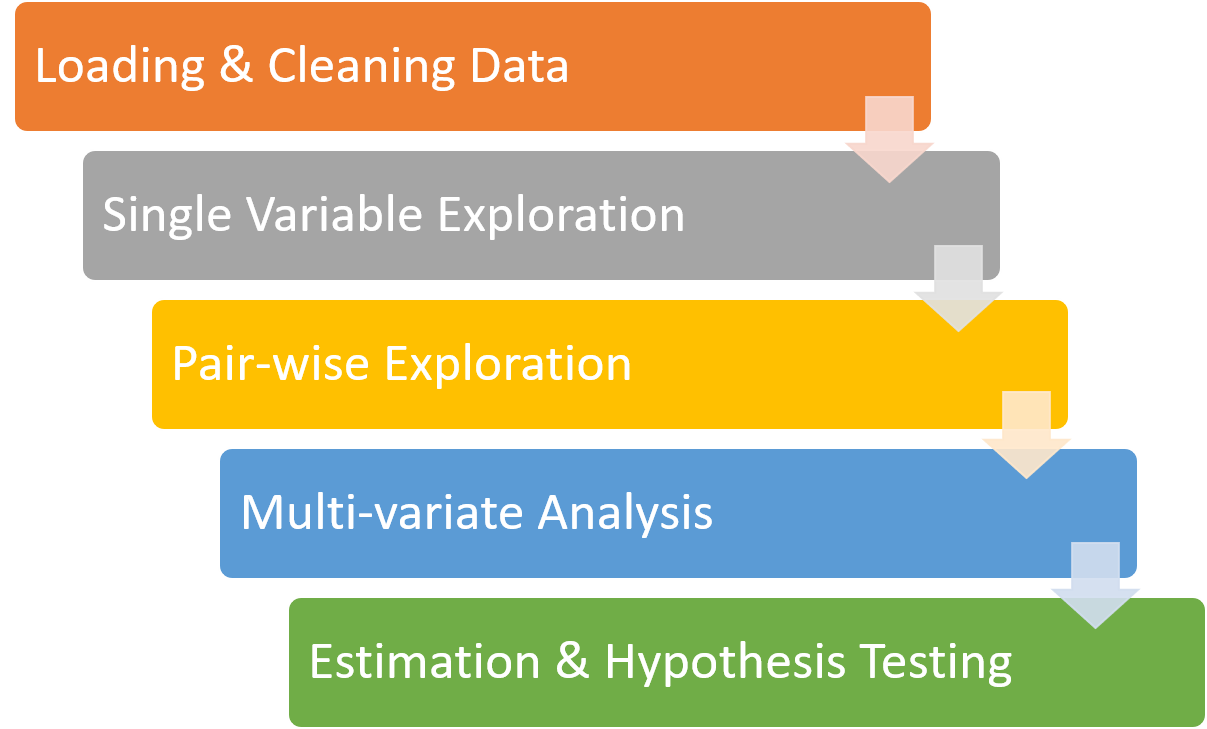
These are the steps that I follow when performing EDA on some dataset.

-
Loading and cleaning:
Whatever format the data is in, it usually takes some time and effort to read the data, clean and transform it, and check that everything made it through the translation process intact. Pandas make it super easy to load data from any major file format. Immediately after loading the data, I like to call
df.head()anddf.shapeto see if everything was loaded correctly. Pandas makes cleaning data super easy & FUN! But there are situations where you might have to use other tools as well. Don’t worry, python has plenty of them. -
Single variable explorations:
I usually start by examining one variable at a time, finding out what the variables mean, looking at distributions of the values, and choosing appropriate summary statistics. In pandas, you can simple call
df.describe()to see summary stats for all the numerical columns. Often times, just by looking at the output, you can easily find a lot about the data. If you see something fishy, then thats the feature you should explore next. PS: People often struggle to figure out what to do next in EDA. Look at the output ofdf.describe(). Its a good starting point. -
Pair-wise explorations:
To identify possible relationships between variables, I look at tables and scatter plots, and compute correlations and linear fits. Scatter plots are great, but at times they can be misleading. Hence, its difficult to make a good scatter plot that is not misleading and might take some time getting use to. I use seaborn, matplotlib and pandas to make plots. One can easily find correlations between different features by calling
df.corr(). In the beginning, I struggled to interpreting the relationship correctly. With some practice you can learn to understand them better. May be some other time, I might write a blog on it. For now, take this . . . keep visualizing your data. -
Multivariate analysis:
If there are apparent relationships between variables, I use multiple regression to add control variables and investigate more complex relationships. Both pearson’s correlation & linear fit can only measure linear relationships. But most of the relationship in empirical data is complex & non-linear. So, you need to be careful. Python has some amazing libraries for exploring linear & multivariate relations like statsmodel, scipy, sklearn, etc.
-
Estimation and hypothesis testing:
When reporting statistical results, it is important to answer three questions: How big is the effect? How much variability should we expect if we run the same measurement again on different sample? Is it possible that the apparent effect is due to chance? Model estimation is a great way to describe you data. With good estimates, you can learn a lot more about the data distribution with very few samples. This is the part where some domain expertise will take you a long way. Say you are working with health data. You need to know what is the range of “blood pressure” that is considered “High BP” and “Low BP”. Same goes for “blood sugar level”. Another thing to know it what common patterns to expect if someone has high BP. With some domain knowledge and common sense, you can easily come up with list of things (or constraints) that should be true/false for the data. These are called hypothesis & the process of verifying these constraints is called hypothesis testing.
-
Visualization:
Visualization is not a step as such. I have still written it because it should be used at every stage of EDA. During exploration, visualization is an important tool for finding possible relationships and effects. Then if an apparent effect holds up to scrutiny, visualization is an effective way to communicate results. I think visualization is more of an ART than science. So, one needs a lot of practice to get mastery over it. You cannot learn to do it from others.
This is the 5 step process that I follow, and the tools that I use while doing EDA. Hope this blog was helpful. I will be discussing each of these steps, in depth, in my future blogs. So, stay tuned and thank you so much for reading.