Distributions
A brief introduction to distributions in statistics.


- Dataset & basic EDA
- Frequency Table
- Bar Plot
- Comparing Bar plots
- Probability Mass Functions (PMFs)
- Histogram
- Probability Density Functions (PDFs)
- Thinks to look for in distributions
- Model Estimation
- Further Reading
In this blog, we will discuss all about distributions from Data Science & EDA perspective. We will be using "diamonds" dataset from seaborn library.
import seaborn as sns
import pandas as pd

data = sns.load_dataset('diamonds')
data.head()
Dataset & basic EDA
Every dataset consists of samples (or records) and for every sample we record multiple features. Here, every sample is a diamond & for every diamond we have recorded carat, cut, color, clarity, depth, table, price, x, y & z features as we can see in the table above.
Its a good practice to check the shape of the dataset, missing values & unique values, even before we start the exploration process.
data.shape
Wow! we have a lot of data . . .
data.isnull().sum()
We don't have any missing values. This is good news.
Now lets look at unique values . . .
data.nunique()
A feature can be either categorical or continuous.
-
Categorical Features: Finite & Distinct values. Here,
cut,colorandclarityare categorical features. - Continuous Features: Infinite & continuous values.
Its extremely important to identify your categorical & continuous features because they require different treatment when it comes to analysis & pre-processing.
data.cut.values
There are 53940 values in total & 5 unique values. But this is not very useful. So lets create a frequency table out of it
data.cut.value_counts()
Now we can clearly see how many diamonds we have for each possible value of cut. This is much better than randomly throwing a list of ~54K values at someone.
Similarly, lets explore other columns . . .
data.color.value_counts()
data.clarity.value_counts()
So far, we have very few unique values. And still we are not able to make such sense out of these frequency tables. Imagine, if we have a lot of unique values then it will quickly become unmanageable.
tmp = data.clarity.value_counts()
p = sns.barplot(x=tmp.index, y=tmp.values)
p.set(xlabel='Clarity', ylabel='Count');

Again, this is much better. We can clearly see people prefer VS2 & SI1 over other category of clarity.
Using these three things (data, frequency table, & bar plot) we can answer a lot of interesting question about our data. For example:
- What is most & least frequent category?
- How many more people bought VS2 compared to VS1?
Things get really interesting once you start repeating the same process for other categorical features as well. Not just other categories, you can also repeat the process for any subset of data.
ideal = data[data.cut == "Ideal"]
ideal.shape
tmp = ideal.clarity.value_counts()
p = sns.barplot(x=tmp.index, y=tmp.values)
p.set(xlabel='Clarity', ylabel='Count');

Now lets, see how clarity is distributed for Good cut of diamonds.
good = data[data.cut == "Good"]
good.shape
tmp = good.clarity.value_counts()
p = sns.barplot(x=tmp.index, y=tmp.values)
p.set(xlabel='Clarity', ylabel='Count');

As you can see most other categories are same but in Good cut diamonds, SI1 is the most popular category where as in Ideal cut diamonds, VS2 is the most popular category.
Lets compare both these distributions by plotting them together . . .
tmp1 = pd.DataFrame(ideal.clarity.value_counts())
tmp1.reset_index(inplace=True)
tmp1['cut'] = 'Ideal'
tmp1.columns = ['clarity', 'count', 'cut']

tmp2 = pd.DataFrame(good.clarity.value_counts())
tmp2.reset_index(inplace=True)
tmp2['cut'] = 'Good'
tmp2.columns = ['clarity', 'count', 'cut']

tmp = pd.concat([tmp1, tmp2])

sns.barplot(x=tmp.clarity, y=tmp['count'], hue=tmp.cut);

Huh 🤔, its pretty obvious that we have many more Ideal diamonds than Good diamonds. Its not a fair comparison, because of bigger sample size, Ideal diamonds are completely overshadowing the Good diamonds.
For a fair comparison instead of comparing absolute frequency values, we should compare the percentage values.
ideal.clarity.value_counts()/len(ideal)
pretty simple, right? If you just divide your absolute values by total number of samples (i.e length of the corresponding dataframe) then you will get percentage values.
The above table shows that 23.5% of Ideal cut diamond has VS2 clarity.
Lets now try to plot these percentage values.
tmp1 = pd.DataFrame(ideal.clarity.value_counts()/len(ideal))
tmp1.reset_index(inplace=True)
tmp1['cut'] = 'Ideal'
tmp1.columns = ['clarity', 'prob', 'cut']

tmp2 = pd.DataFrame(good.clarity.value_counts()/len(good))
tmp2.reset_index(inplace=True)
tmp2['cut'] = 'Good'
tmp2.columns = ['clarity', 'prob', 'cut']

tmp = pd.concat([tmp1, tmp2])

sns.barplot(x=tmp.clarity, y=tmp.prob, hue=tmp.cut);

WOW! this is huge difference. Take a minute to compare both the plot. Can you spot the difference? Hint: look at y-axis.
Clearly, SI1, SI2 and I1 are more popular in Good diamonds than Ideal diamonds. This was not visible when we tried to compare them using absolute values.
For example, lets try to make a bar plot for carat feature
tmp = data.carat.value_counts()
sns.barplot(x=tmp.index, y=tmp.values);

The labels on the x-axis are not at all readable. There are so many small values that are hardly visible. Also, a lot of unique values make it difficult to understand the plot. We will see, how we can use histograms to alleviate this problem.
sns.histplot(data=data, x='carat', bins=50);

But histograms are not perfect. Changing the number of bins can result in drastically different plot. It can also obscure some meaningful insight from the data. Here is example
sns.histplot(data=data, x='carat', bins=100);

The plot will 100 bins looks very different from the one with 50 bins.
Histograms works great when you well defined bins. For example: all age <18 is minor, >18 & <60 is adult, and >60 is senior citizen. In other cases, try to avoid them.
Probability Density Functions (PDFs)
For simplicity, you can think of PDFs are histograms with a lot of bins & then some smoothing to reduce the impact of missing values & noise.
Technical Stuff (not important)
Technically, PDFs are derivatives of Cumulative Distribution Functions (CDFs). CDFs are nothing but cumulative sum of PMFs.
In physics, Density of a substance is defined as mass per unit volume. No matter how the mass or volume changes, their ratio (i.e density) will always remain constant. Similarly, no matter how many data points you select from the distribution and the absolute values of these data points, the PDF will (more or less) look the same.
Hence, PDF is a very apt name. Density is the way you summaries substances & also distributions. PDF is the standard way to describe any distribution.
PDFs are very expensive to compute & often times don't have real solutions. Kernel density estimation (KDE) is an algorithm that takes a sample and finds an appropriately smooth PDF that fits the data. You can read details at wikipedia.
Don't worry about all these technical details, you can easily make KDE plot using seaborn.
sns.kdeplot(data=data, x='carat');

In summary, you can always use KDE plots for continuous features & bar plot for categorical features. If you have well defines bins for continuous features then you can also use histograms.
Thinks to look for in distributions
Often, we want to summarize the distribution with a few descriptive statistics. Some of the characteristics we might want to look for, are:
- Central tendency: Do the values tend to cluster around a particular point?
- Modes: Is there more than one cluster?
- Spread: How much variability is there in the values?
- Tails: How quickly do the probabilities drop off as we move away from the modes? Skewness is a property that describes the shape of a distribution. If the distribution is symmetric around its central tendency, it is unskewed. If the values extend farther to the right, it is right skewed and if the values extend left, it is left skewed.
- Outliers: Are there extreme values far from the modes? The best way to handle outliers depends on “domain knowledge”; that is, information about where the data come from and what they mean. And it depends on what analysis you are planning to perform
Statistics designed to answer these questions are called summary statistics.
Along with these plot, you can used other stats about the distribution like mean, median, mode, min, max, 25 & 75 percentile, Inter Quartile Range (IQR), etc to better understand & describe your distribution.
Model Estimation
There are two types of distributions: empirical and analytic.
The distributions we have used so far are called empirical distributions because they are based on empirical observations, which are necessarily finite samples.
On the contrary, analytic distributions are described by analytic mathematical function. Here are some popular analytic distributions : normal/guassian, log-normal, exponential, binomial, poisson, etc. Here is a good blog discussing some of these distributions in detail.
It turns out that many things we measure in the world have distributions that are well approximated by analytic distributions, so these distributions are sometimes good models for the real world. By "Model", I mean a simplified description of the world that is accurate enough for its intended purpose.
Why model/estimate?
- Like all models, analytic distributions are abstractions, which means they leave out details that are considered irrelevant. For example, an observed distribution might have measurement errors or quirks that are specific to the sample; analytic models smooth out these idiosyncrasies.
- Analytic models are also a form of data compression. When a model fits a dataset well, a small set of parameters can summarize a large amount of data. For example, to describe a normal distribution, you only need two parameters: mean & standard deviation.
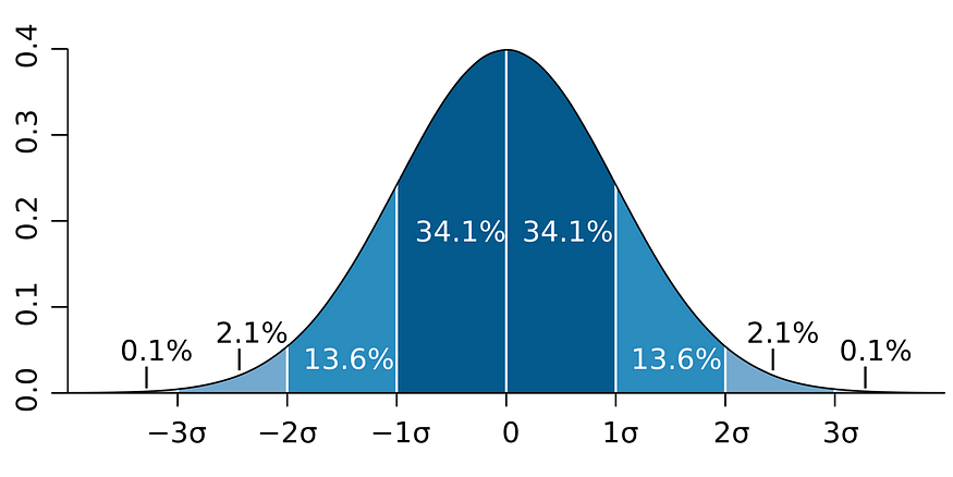
- A lot of study is already available for analytic distributions. For example, if you know your data follows normal distribution then you can easily tell the range in which 68.2% of your data will lay by looking at the image below.
Hope you had a wonderful time reading this blog and also, you learned something useful. Cheers 🎉
Further Reading
- Seaborn Distributions tutorial - Highly Recommended
- Distributions in SciPy